
Monday, January 9, 2012
Sketch #23
Sketch #22

Sketch #21

Sketch #20

Sketch #19

The two creatures at the bottom, however, are of course Pocket Monsters.
#001 Bulbasaur and #026 Raichu, two of my favourites. And I drawed them OK too. I hate how Pikachu's design has morphed from the original ball of tub it was in 1996 to the horrible skinny thing that it now continues to be in the wretched delusional world of Ash Ketchum; while Raichu is still just as tub as its was first designed as. So I try to make the Raichu that I draw more healthy, though this one might not qualify for that distinction. (Note: the pluarl form of any Pokémon is the same as the singular form)
Sketch #18

Sketch #17

The symbol off to the right is an attempt to create a logo for myself, incorporating my initials KH. It looks like it should be the play button on some ancient VCR machine.
Alright, now all the stuff in the lower third here. You can ignore it if you really want, but I'll try explain it.
I was given a list of Things To Draw as part of a separate attempt to draw more stuff. A friend and I would each draw a thing from the list and send it to each-other. One of the things was "An imaginary failed product".
So brainstorming in mah sketchy book I imagined my product to have failed due to poor marketing, like when you lined a bunch up on a shelf it looked bads. So, like, what if it was called "apcr"; and then when put in a row you would get "apcrapcrapcrapcrapcrapcr". But, as a name, that isn't even pronounceable.
So I went with a more visual take on the same idea, like a Vulgar Shape (not related to Vulcan Salute) magically appearing on the supermarket shelf. To add to the vulgarity and hilarity (hilgarity) I chose the product to be soy milk. It may just be the most immature thing I have even drawn. But my intentions were pure! Honest!
Sketch #16

Quickly! Draw a hand! Didn't turn out well? Oh well, just do some posing heroically in a looking up at him perspective. That shirt isn't actually stripy, they are just Perspective Enhancement Line, as is the intenced function of the beard and spikey hair; though what those two do is actually make the guy look kinda like me.
Sketch #15
 So another attempt at drawing a shoe. It seems to be kicking Cloak Man, whom I don't like the perspective of and his cloak is far too short. Though I do like the how his left hand looks. His right hand is OK too, I guess.
Houndoom is a Dark/Fire type dog Pokémon. (Get it Hound + Doom?!) He actually turned out alright despite those suspiciously cat-like pointed ears. And if you don't really like Pokémon never fear! There are many, many more of them yet to come in this sketch book.
The images at the bottom are Professor Layton, an English Professor from the Nintendo video game series Professor Layton. The standing one on the right is so many kinds of messed up but the middle one is not too horrible. The one on the left can be invisible, bar his hat of course.
Sketch #14
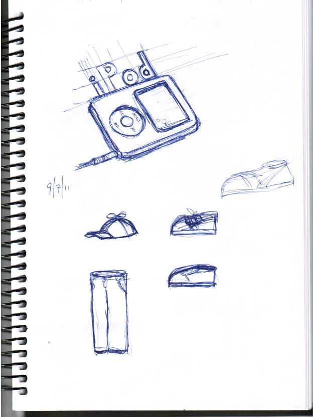 Searching for inspiration in the staff room, the most interesting thing I could see to draw was something that I see and use near every day; my iPod. Just in case you are unaware of what this iconic piece of technology is I helpfully included a label in the drawing. Bonus! I added the small air bubbles in the bottom right of the screen protector.
Inhabiting the bottom half of the page are parts of a Homestar Runner costume I was thinking about. I needed a hat with a spinner, white and blue shoes and white trousers. As if drawing them would somehow assist with the acquisition of these items I, uh, ... drew them. My shoe rendering technique requires improvement.
Subscribe to:
Posts (Atom)